Earth First
Art Director
In this branding system for Earth First the client sought a visually appealing and approachable brand vision that expresses a handcrafted essence. Incorporating block-style illustrations and sharp line art vectors with a natural color palette and sans-serif typography, I successfully created a distinctive visual branding style that sets it apart from rivals in the crowded eco-friendly market.
I developed the entire branding system for this company, including its name and all associated elements. The logotype design draws inspiration from vintage recycling and "pitch-in" graphics of the past, while the color palette was chosen to reflect a clear connection to Mother Earth.

Eco-Friendly Products For Food Service

Brand Style Tile

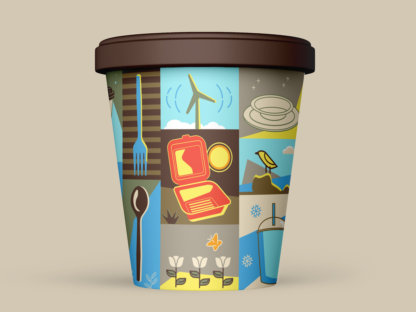
Brand Illustration Style Tile
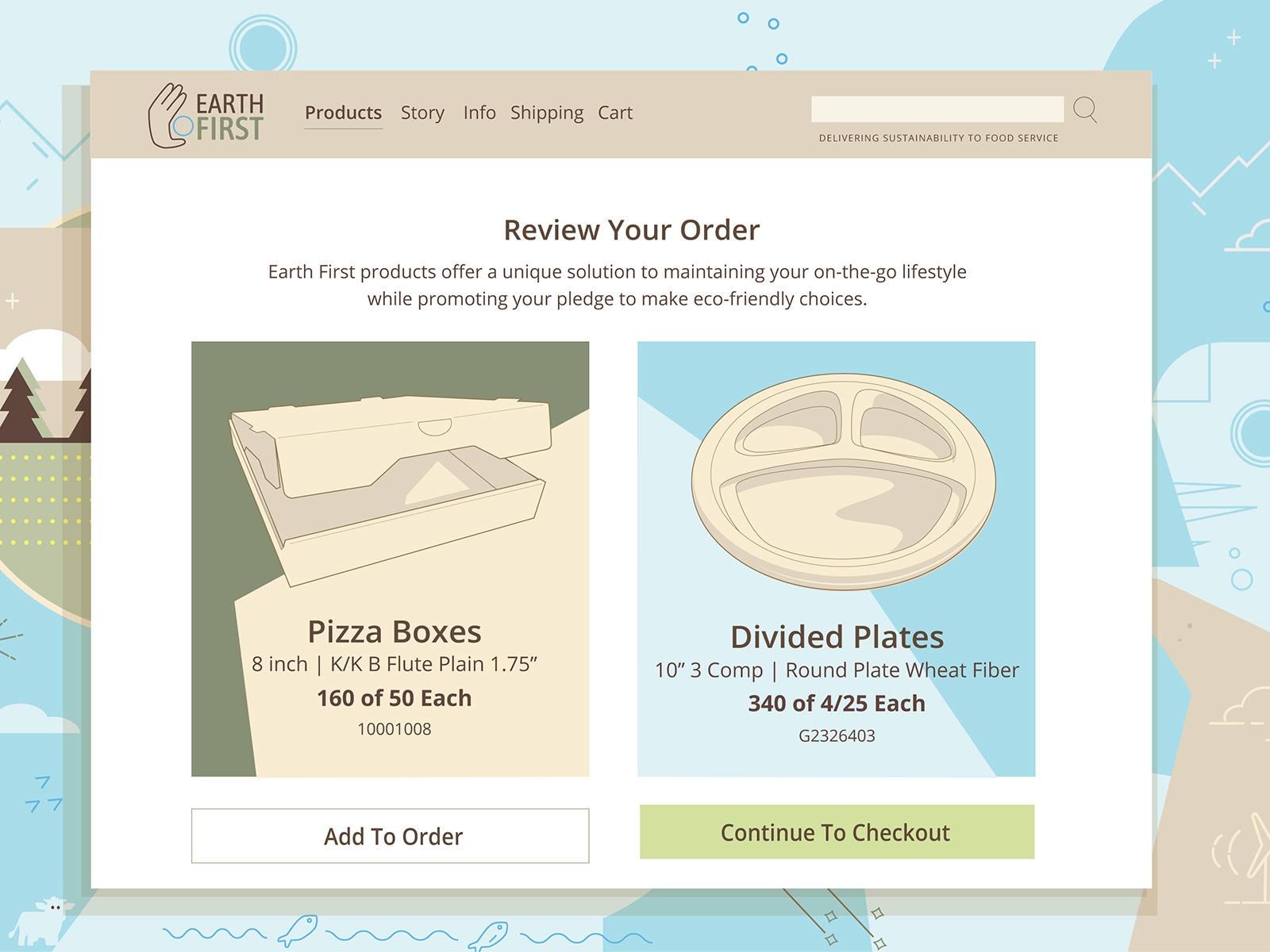
Digital Layout
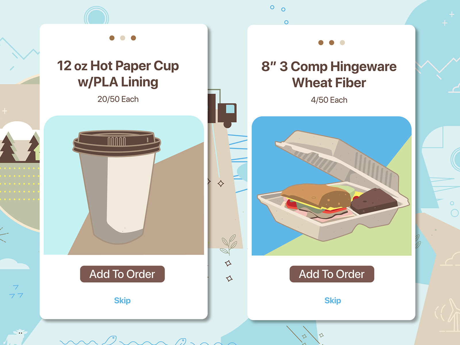
Mobile Screens

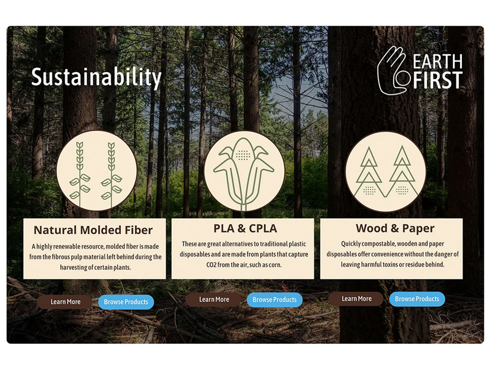
Trade Show Graphic

Trade Show Graphic
Slide Deck Cover
Landing Page
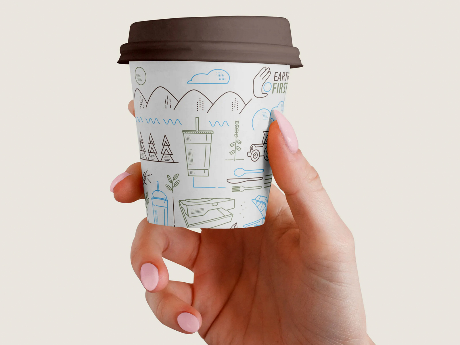
Hot Cup Design

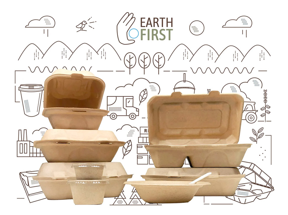
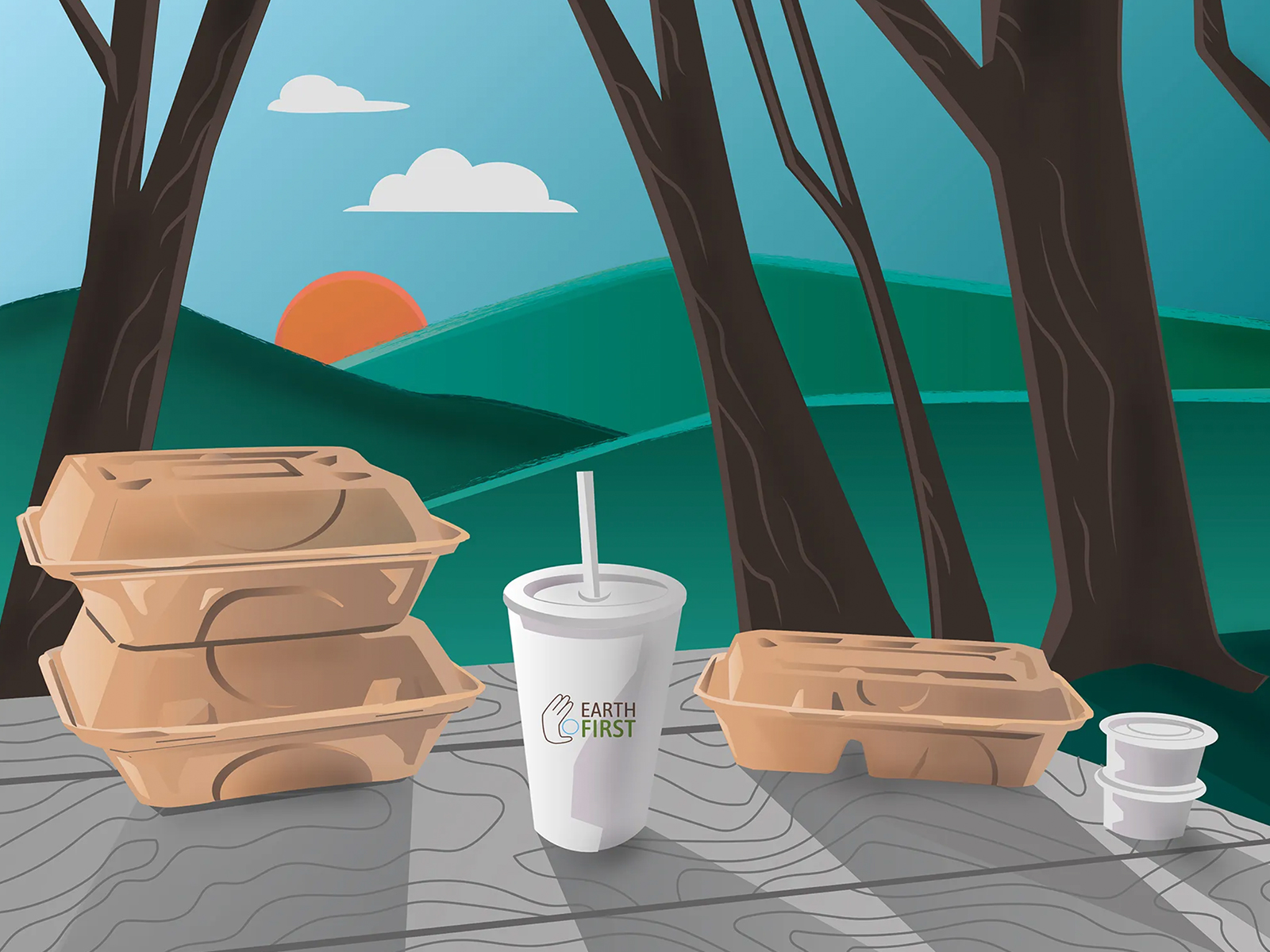
Brand Graphic
Trade Show Graphic
Reusable Soup Cup

Sales Report Cover

Food Fanatics Magazine Ad

T Shirt Bag Design

Trade Show Graphic
